X — @kynthstudios
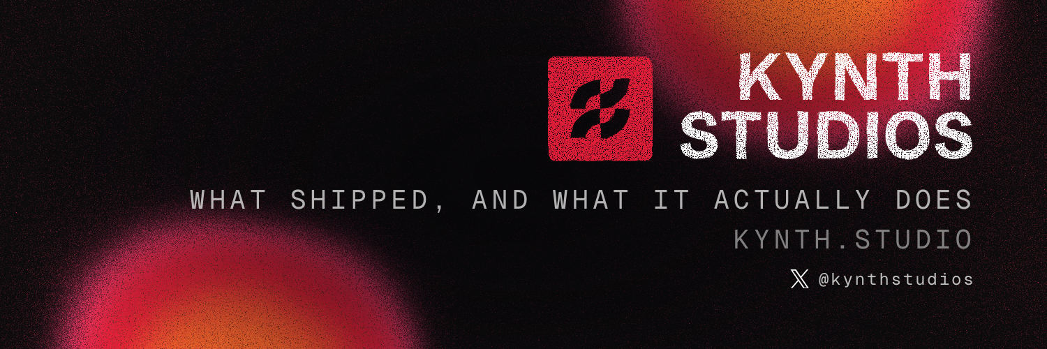
1500×500 · 3:1 · avatar eats 250×250 bottom-left · 60px top/bottom is bleed
The identity of Kynth Studios — the mark, the seal, the erosion, the type, the colour, the ground and the banners — and the reason behind every one of those decisions.
(00)
This is a record of an identity that already exists, written so that anyone — a contractor, a future collaborator, or the studio itself six months from now — can extend it without guessing.
Every asset on this page is generated from the file that ships it, not redrawn for the document. The eight seals below are live SVG, cut by the same functions the studio's own seal study uses. The banners are the exact PNGs and JPEGs that were uploaded. The colours, the filter parameters, the platform dimensions and the glyph path are read out of source at build time, and the build fails loudly if any of them has moved.
That matters because a brand book is the artefact most likely to drift. A book that is
hand-written once describes the identity on the day it was written, keeps looking authoritative
forever, and is wrong about six months later — with nothing anywhere to signal it. This one is
rebuilt with node brand/brand-book.mjs, and if the mark ever forks between the site's
nav and the seal study, the build refuses to produce a book at all.
(01)
Two identical ribbons, hooked through one another. It is a knot, not a letter.
The whole figure is four quarter-annuli and nothing else. Each arm sweeps 90° at an inner radius of 64 and an outer radius of 128, inside a 256-unit box. That makes the stroke exactly 64 units wide — one quarter of the box — everywhere in the mark, with no thick and thin, no optical correction and no tapering.
C in the path is the standard
cubic approximation of a 90° arc; the control offsets are all 0.5523 of the radius.Read as two objects rather than four, it is a pair of S-ribbons of constant width, each hooking into the counter the other one leaves. Neither ribbon is on top. There is no over-and-under, no drop shadow and no third colour deciding which strand wins — the interlock is carried entirely by the fact that both hooks are the same shape and neither closes.
The studio's argument is range: one person taking wildly different products from nothing to shipped, across domains that have no business sitting next to each other. A knot is the figure for that. It is not a picture of software, an industry, a letterform or a category — a monogram would have said "K", and "K" says nothing about what the work is. Two identical strands doing the same job in opposite directions, holding without a fastener, is the whole thesis compressed into one shape.
One string, three consumers, byte-identical in all of them — checked by this build, which refuses to emit a book if they ever diverge:
GLYPHMARK, and via it every seal belowM 128 192 C 92.654 192 64 220.654 64 256 L 0 256 C 0 185.308 57.308 128 128 128 Z
M 256 128 C 256 198.692 198.692 256 128 256 L 128 192 C 163.346 192 192 163.346 192 128 Z
M 128 64 C 92.654 64 64 92.654 64 128 L 0 128 C 0 57.308 57.308 0 128 0 Z
M 256 0 C 256 70.692 198.692 128 128 128 L 128 64 C 163.346 64 192 35.346 192 0 ZThe mark takes exactly two fills. Flat vermilion is the default and the only one used inside a seal. The aurora ramp — the three-stop gradient the studio has carried since the 2026-07 pivot — appears when the glyph is drawn bare, without a plate around it: the live site's nav mark is the canonical case.
(02)
A studio mark's only real job is to say who made this. A chop is the object that does exactly that, and has done for two thousand years.
A logo badge announces a company. A seal — a hanko, a 落款 rakkan, an artist's chop — does something narrower and more useful: it is pressed into the corner of finished work by the person who finished it. It arrives after the thing is made, not before. It is small. It sits at the edge. It never competes with what it is signing, and its whole meaning is this is mine, and it is done.
That is precisely the relationship Kynth Studios has to what it puts out. The work is a landing page, an MVP, a wire, a film, an agent lane — dozens of them, in domains with nothing in common. The studio is not the subject of any of them. It is the hand in the corner. A container that means "signed by" rather than "brought to you by" is the correct one, and the fact that it also happens to be beautiful at 24px in the corner of a photograph is what makes it practical as well as right.
The vermilion is not decoration either. Seal paste — 朱肉 shuniku — is cinnabar in oil, and its red is the reason a chop reads instantly against black ink on paper. The studio's ground is near-black and its type is cream: the same three-value problem, and the same answer.
The carver removes the strokes, so the plate prints solid and the mark appears as knocked-out paper. Heavier, louder, and the default here — a solid vermilion block survives being small in a way a hairline never does.
The reverse: the carver removes the ground, so only the strokes take ink. Lighter and more literary. Correct where the seal sits on a light, quiet surface and a solid block would shout.
Live SVG, drawn at 132px on a paper plate. These are the same eight functions the banner pipeline calls; nothing here is a picture of a seal.
The seal doing its actual job — a corner bug at shipping size, over real ground. The warm frame is the hard case: a red seal on a warm brown subject sits close to its background in hue, which is why mono-white exists.
(03)
The chewed edge and the lifted pigment are computed, every time the seal is drawn. Nothing about the texture is a picture.
A real chop never lands clean. The edge of the plate is irregular, the paste does not take evenly, and the impression carries voids where the pigment lifted. Faking that with a texture PNG is the obvious move and the wrong one. The erosion here is two SVG filter passes, evaluated at render:
Low-frequency feTurbulence driving an
feDisplacementMap at high amplitude. This warps the whole shape's perimeter, so the
plate stops being a perfect rounded square and the knocked-out glyph stops being a perfect
curve.
Coarse fractal noise pushed through an feColorMatrix
with a hard gain and a negative bias — a threshold. Only the bottom tail of the noise
distribution punches through, so what is removed is a few big soft voids, not an even
scatter.
/* Procedural ink filter.
   Two independent passes, deliberately at different scales:
     1. EDGE CHEW  — low-frequency displacement, high amplitude. Irregular perimeter.
     2. INK LIFT   — coarse fractal noise, hard-thresholded so only the bottom tail of
                     the distribution punches through. Big soft voids, solid core.
   The failure mode to avoid is a high-frequency void layer: that reads as halftone
   dither, not as pigment that didn't take. */
function inkFilter(id, {warp=3.2, freq=0.055, gain=8, bias=-2.5, seed=11}){
  return `<filter id="${id}" x="-25%" y="-25%" width="150%" height="150%" color-interpolation-filters="sRGB">
    <feTurbulence type="fractalNoise" baseFrequency="${freq}" numOctaves="4" seed="${seed}" result="n1"/>
    <feDisplacementMap in="SourceGraphic" in2="n1" scale="${warp}" xChannelSelector="R" yChannelSelector="G" result="d1"/>
    <feTurbulence type="fractalNoise" baseFrequency="0.85" numOctaves="2" seed="${seed+4}" result="n2"/>
    <feColorMatrix in="n2" type="matrix" values="0 0 0 0 0  0 0 0 0 0  0 0 0 0 0  0 0 0 ${gain} ${bias}" result="holes"/>
    <feComposite in="d1" in2="holes" operator="in"/>
  </filter>`;
}size. A raster would need an export
per size, and the exports would drift.size is the displacement
amplitude and the void threshold — the curve in tune() below. The type filter goes
further and solves its frequencies from the seal size, which is what makes the speckle on the
wordmark physically the same size as the speckle on the seal beside it. A scaled PNG can do
neither: it scales its noise with the image, so a large seal gets boulders and a small one gets
sand.Two things, and neither is optional. The curve lives in the component that draws the mark, quoted here in full:
/**
 * Two things have to change as the seal gets smaller, and neither is optional:
 *
 *  1. THE GLYPH GROWS RELATIVE TO THE PLATE. At 22px a mark drawn at the large-format ratio
 *     (0.567 of the plate) leaves the four quadrant pieces about 2px apart, and they merge into
 *     a blob. Opening it to 0.63 keeps the counters legible.
 *  2. THE EROSION BACKS OFF. Displacement amplitude is in plate units, so it scales down with
 *     the seal — but the *threshold* does not, and a void that removes 30% of a 120px seal
 *     removes 30% of a 22px one too, where there is no detail to spare. Below 34px the voids
 *     are pulled back to a trace and the chew is halved.
 */
function tune(size: number) {
  const t = Math.max(0, Math.min(1, (size - 24) / 40)); // 0 at <=24px, 1 at >=64px
  return {
    glyph: 0.63 - 0.063 * t,     // plate fraction the mark occupies
    warp: (1.4 + 1.6 * t),       // displacement, in plate units
    bias: -(3.5 - 0.6 * t),      // void threshold: -bias/gain. higher = fewer voids
    radius: size < 30 ? 7 : 9,
  };
}
The threshold is the subtle one. Displacement amplitude is expressed in plate units, so it scales down with the seal on its own. The void threshold does not — a setting that removes 30% of a 120px seal removes 30% of a 22px one too, where there is no detail to spare. Below 34px the voids are pulled back to a trace and the chew is halved, and the glyph's share of the plate opens up so the four quadrant hooks do not merge into a blob.
The real test. A corner watermark lands somewhere between 24px and 48px on a phone. Every carving, at every size it might ship at, live.
(04)
One face does everything, and a mono does the labels. Plus the measurement that makes the wordmark and the seal read as a single object instead of two things placed near each other.
The Kynth Studios typeface. The wordmark in the seal lockup, the live site's nav and
chrome, every headline — including the ones on this page. Variable across 100–900, so one file
covers a 104px cover title and a 13px caption without a second family being introduced to do
it. Tight apertures and a high cap height, which is what makes the two-line cap-flush stack
below work at all. Vendored at brand/seal/assets/bdo-grotesk.woff2; the apex site
serves the same face as BDO Grotesk Variable.
The second and last face. Tracked uppercase, used for every support line, spec, caption,
table and label — the banner support lines, the seal ids, all the small type on this page.
Mono at wide tracking reads as an annotation, so it can sit under a headline without competing
with it. brand/kit/fonts/GeistMono-Regular.ttf.
Both official, both shipping, and the choice between them is about the surface underneath, not about taste.
The grain on the letters is a separate filter from the seal's — forked deliberately, so that tuning the type can never touch an approved carving. Its frequencies are solved from the seal size, so the speckle on the wordmark is physically the same size as the speckle on the seal beside it. The type stays live, selectable DOM text throughout.
/* Ink for the TYPE. Deliberately a SEPARATE filter from the marks' inkFilter —
   forked, not shared, so tuning type never touches an approved seal.
   The frequencies are solved from the seal size so the grain on the letters is the
   same physical size as the grain on the seal beside it: the mark draws its noise in
   a 120-unit viewBox scaled to `size` px, this filter draws in CSS px. */
function inkTextFilter(id, size, strength){
  const px      = size / 120;              // one mark unit, in CSS px
  const voidF   = (0.85 / px).toFixed(3);  // matches the mark's 0.85 void field
  const edgeF   = (0.05 / px).toFixed(3);  // matches the mark's 0.05 edge field
  const warp    = (3.0 * px * strength).toFixed(2);
  const bias    = strength >= 1 ? -2.9 : -3.15;
  return `<filter id="${id}" x="-18%" y="-28%" width="136%" height="156%" color-interpolation-filters="sRGB">
    <feTurbulence type="fractalNoise" baseFrequency="${edgeF}" numOctaves="4" seed="19" result="tn"/>
    <feDisplacementMap in="SourceGraphic" in2="tn" scale="${warp}" xChannelSelector="R" yChannelSelector="G" result="td"/>
    <feTurbulence type="fractalNoise" baseFrequency="${voidF}" numOctaves="2" seed="23" result="tv"/>
    <feColorMatrix in="tv" type="matrix" values="0 0 0 0 0  0 0 0 0 0  0 0 0 0 0  0 0 0 9 ${bias}" result="tvoids"/>
    <feComposite in="td" in2="tvoids" operator="in"/>
  </filter>`;
}
The wordmark sets in two lines beside the seal, and the cap-top of KYNTH sits exactly on the seal's top edge while the baseline of STUDIOS sits exactly on its bottom edge. Not approximately. The measured worst-case error across every lockup on this page is printed under the figure.
It matters because that single alignment is what makes the pair read as one object. Off by two or three pixels, the eye does not see a mistake — it sees a mark with some type near it, which is a materially weaker thing. A seal is a stamp; a stamp with a name flush to its edges is a signature. The whole reason the lockup does not need a box, a rule or a container holding it together is that the alignment already does that job.
Getting there is not a matter of picking a font size that looks right, because the browser
does not lay type out on cap-height. It lays it out on line boxes, which include ascent,
descent and half-leading — none of which are the cap. So the metrics are measured off the
loaded face through canvas TextMetrics, and the half-leading is stripped with
negative margins computed from those measurements.
/* MEASURED font metrics, read from the actually-loaded face via canvas TextMetrics.
   cap  = cap height (top of "H" to baseline), as a fraction of em
   asc  = font ascent, desc = font descent — needed to strip the browser's half-leading.
   Guessing these is what made the text overshoot the seal. */
const MET = {};
function metrics(face, weight){
const M = metrics(face, weight);
/* Solve font-size so cap-top(line 1) -> baseline(line 2) == flush x seal height.
That span is font*(lh + cap): one full line advance plus one cap height. */
const font = (flush * size) / (lh + M.cap);
/* Strip the half-leading the browser puts above line 1 and below line 2, so the
element's layout box equals that span exactly.
halfLead = (lh - (asc+desc)) / 2 air added above AND below each line
trimTop = halfLead + (asc - cap) line-box top down to the cap
trimBot = halfLead + desc baseline down to line-box bottom */
const halfLead = (lh - (M.asc + M.desc)) / 2;
const trimTop = (halfLead + (M.asc - M.cap)) * font;
const trimBot = (halfLead + M.desc) * font;(05)
One red, one ink, one paper, one cream — and a three-stop ramp that is the only place any other hue appears.
The house red is #E01E37, and the interesting question is not whether it is nice but whether a brand red or a traditional pigment is the right one for a seal. Both were cut and compared:
The traditional pigments are warmer, duller and objectively closer to a real shuniku impression — and that is exactly why they lose. #E01E37 is already load-bearing everywhere else in the system: it is the nav mark, the Send-the-brief button, every accent on kynth.studio and the mid stop of the aurora ramp. A seal in cinnabar would be a second red, and a second red is how an identity starts to look like two identities. The seal takes the colour the studio already has.
Three stops — #FF4D8D → #E01E37 → #FF7A29 — running pink through the house red to
orange. It has exactly two jobs, and no third:
(06)
One shader, one frame, one set of parameters. It is the only ground the studio has.
The background behind every banner is a real GrainGradient from
@paper-design/shaders-react, held at a fixed frame and rendered through headless
Chrome with WebGL on SwiftShader. It is not a gradient mesh, not a Photoshop file, and not an
export somebody once made and everyone has been re-cropping since. It regenerates.
| speed | 0 | frozen. a still frame, not a paused animation |
| frame | 6100 | the exact frame. this number IS the artwork |
| colorBack | #0B0B0C | the ink the ramp sits in |
| colors | #FF4D8D, #E01E37, #FF7A29 | the aurora ramp, unchanged |
| softness | 0.72 | edge falloff between the colour fields |
| intensity | 0.42 | how far the colour pushes out of the ink |
| noise | 0.38 | the grain itself |
| shape | corners | colour fields anchored at the corners |
| veil | .4 | a radial darkening over the centre, so type has ground to sit on |
// The grain ground. THIS is the Kynth Studios banner — nothing else is.
const GrainGround = () => (
  <GrainGradient style={fill} speed={0} frame={6100}
    colorBack="#0B0B0C" colors={["#FF4D8D", "#E01E37", "#FF7A29"]}
    softness={0.72} intensity={0.42} noise={0.38} shape="corners" />
);The seal's own erosion is a threshold on noise. The ground is noise. They are the same idea at two scales, which is why the seal sits in this ground rather than on top of it — the texture of the mark and the texture of the field are made the same way.
Four other shader grounds were built on the identical lockup and shown side by side: dithering, perlin noise, neuro noise and dot orbit. All four were rejected. They are not kept as alternates and they are not commented out — they are gone from the banner page.
(07)
One design, cut per platform at that platform's real upload size. Not one master, cropped seven ways.
Every frame below is authored at its native pixel size. The LinkedIn company cover is a 6:1 composition, not a 3:1 banner squeezed into a band; the YouTube channel art is composed inside its guaranteed strip, not centred in a 1440px frame and hoped for. Everything scales off the frame's usable height against the 500px the lockup was drawn at, so a 700px band and a 396px cover get the same optical weight rather than the same pixel numbers.
What is identical across all seven: the ground, the seal, the wordmark, the cap-flush, the erosion. What varies: where the block sits, the line of copy, and the platform chip. The copy varies for a reason — the first line says what that account posts, so a visitor landing on a profile learns what the feed is instead of reading the same slogan for the seventh time.
| Surface | Upload | Ratio | The trap |
|---|---|---|---|
| X | 1500×500 | 3:1 | the avatar covers ~250×250 bottom-left; ~60px top and bottom is bleed; type under ~40px is mush once X squeezes the header to phone width |
| Bluesky | 3000×1000 | 3:1 | recompresses anything past ~1MB, and eroded type is exactly what goes fuzzy — so it ships as a JPEG already under the threshold |
| LinkedIn company | 4200×700 | 6:1 | LinkedIn's own spec, not the personal number the estate had been using; the logo tile covers the left 23% |
| LinkedIn personal | 1584×396 | 4:1 | safe zone about 1350×220, centred; avatar bottom-left |
| YouTube | 2560×1440 | 16:9 | only the centred 1546×423 is guaranteed on every device — everything outside it is decoration that some viewers never see |
The avatar or logo dead zone is bottom-left on every one of these platforms. So "left" means left of centre but well clear of it, and the block never drops into that corner. The platform chip is the other half of the problem: on the tight 3:1 headers the bottom ~60px is bleed and the avatar owns the bottom-left, so a corner chip either hides in the bleed or collides with the last line of type. On those frames the chip becomes the block's last line instead — it can never collide, and it inherits the block's alignment for free. Only the 6:1 LinkedIn band and YouTube's safe strip have the room to keep a corner mark.
These are the actual files that were uploaded, inlined at reduced resolution.
1500×500 · 3:1 · avatar eats 250×250 bottom-left · 60px top/bottom is bleed
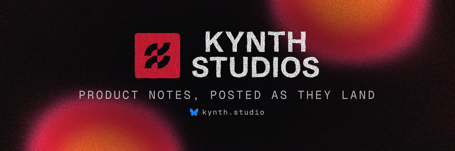
3000×1000 upload · 3:1 · same avatar overlap · ships as JPEG so Bluesky’s recompression cannot fuzz the type

4200×700 · 6:1 · LinkedIn’s own spec · logo tile eats the left 23% · renders 792×134
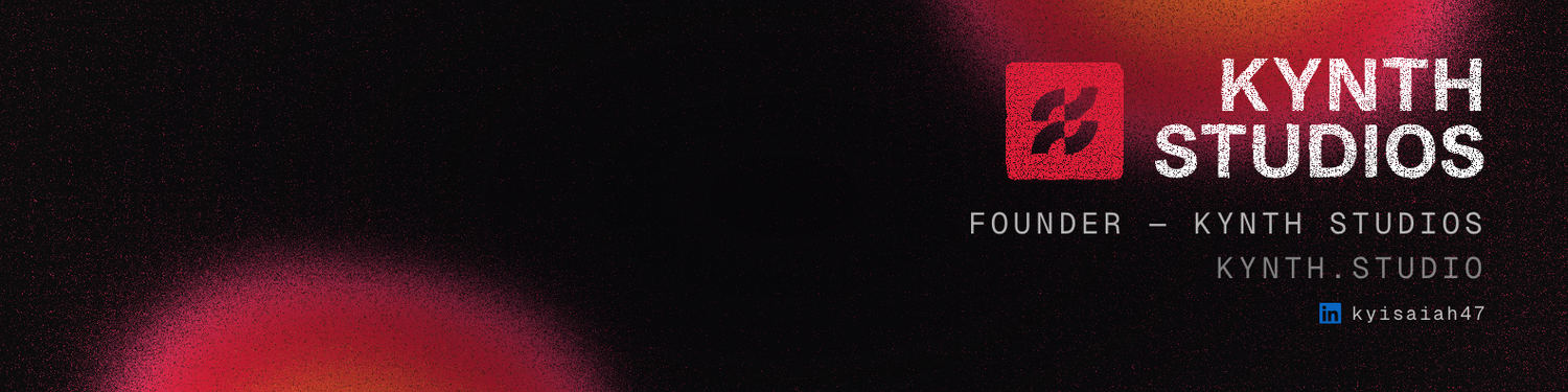
1584×396 · 4:1 · safe zone ~1350×220 centred · avatar bottom-left
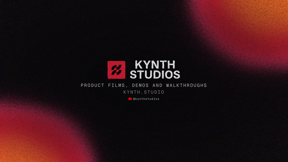
2560×1440 · only the centred 1546×423 is guaranteed on every device · everything lives inside that strip
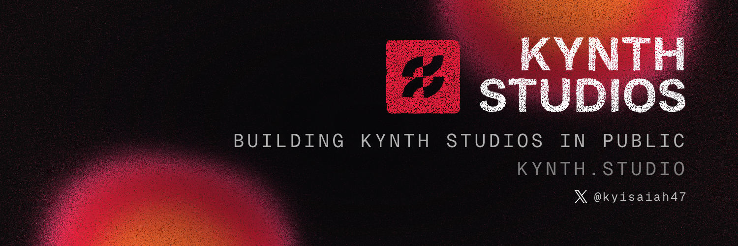
1500×500 · same design language, founder line
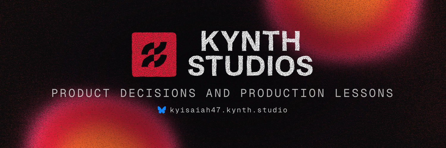
3000×1000 upload · founder line
(08)
Settled decisions. These are not preferences to weigh against convenience at the point of use.
(09)
Every seal on this page is live SVG, drawn by the same functions that cut the studio's own artwork. Nothing here is a picture of the identity.
This document is generated. The mark's geometry, the eight carvings, the ink filters, the cap-flush measurements, the shader's parameters and the banner dimensions are all read out of the files that produce the real artwork, at build time — so the book cannot describe an identity the studio no longer has. If the mark ever forked between the site's header and the seal study, the build would refuse to produce a book at all.
The banners above are the actual uploaded files, shown at reduced resolution. The colour values are the ones this page is painted in. The type is the face you are reading.
Generated 2026-08-16 ·